
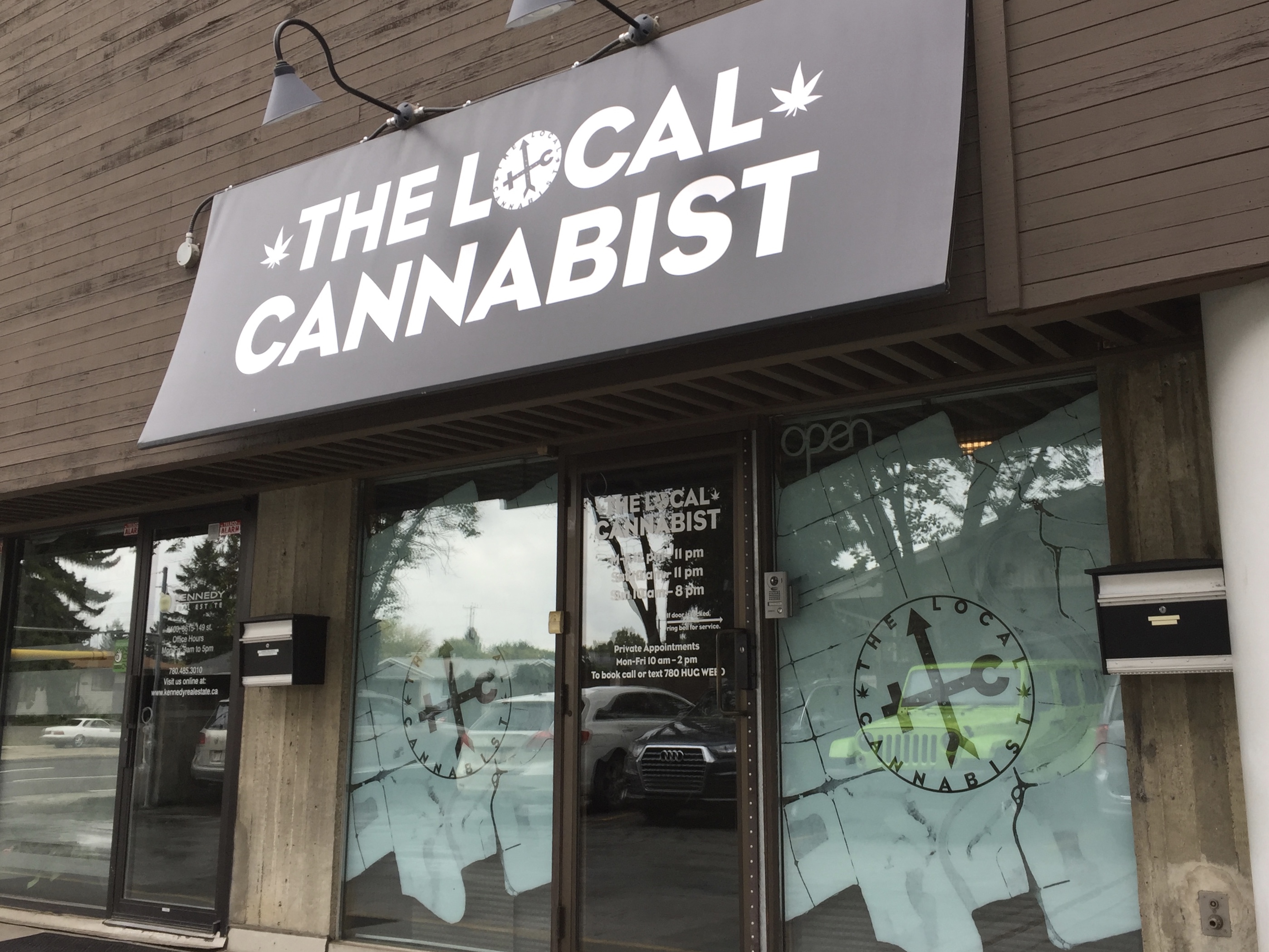
As Creative Director of “The Local Cannabist” [TLC], Canada’s premier independent cannabis retailer, I conceived and designed the brand identity, including the following logos, posters, signage, and related artworks.
Logo
The logo incorporates a main ‘cross’ element, angled so as to not be construed as a medical symbol. This element represents the intersection at which the store lies, as is labelled as such: 149 ST & 87 AV. Lower case “tlc” letters comprise the horizontal element of the cross, and represent the neighbouring major intersections to the west, and traffic circle to the east. The vertical element is an arrow pointing north from the Whitemud Freeway on- and of-ramps to the south. Two stylized cannabis leaf elements brace the logo on either side, in both a circular, graphic-dominant form, and a horizontal, text-dominant format.
Posters
“Prohibition Ends At Last” text written by me, celebrating cannabis legalization, introducing The Local Cannabist, and announcing the TLC mission.

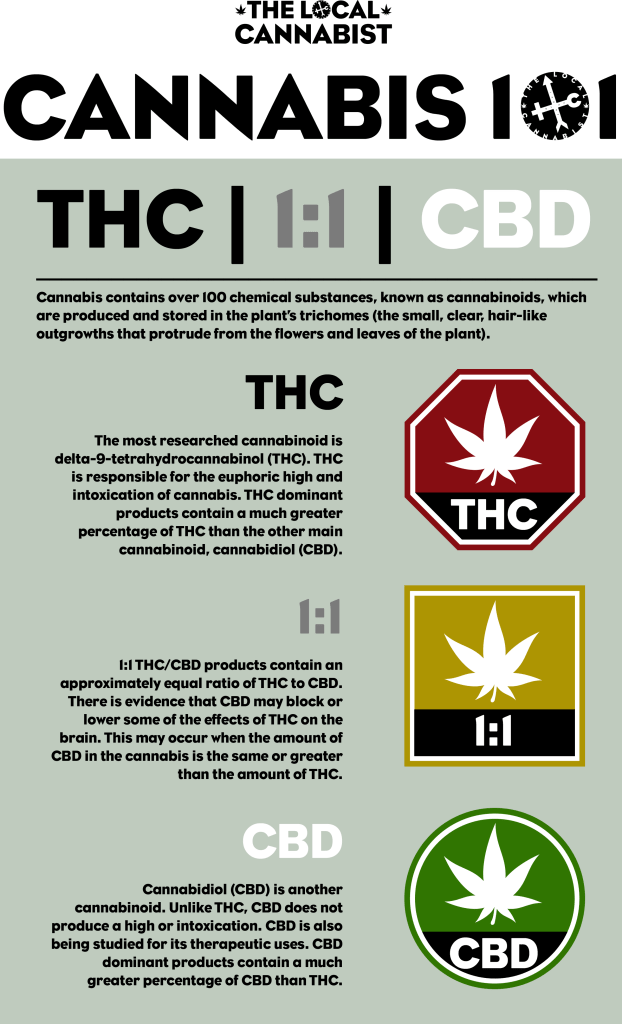
“Cannabis 101” symbols, using TLC’s stylized cannabis leaf graphic to introduce a better cannabis labelling system than the inaccurate current government standard. Using the government’s red stop-sign THC graphic as a basis, here I introduce complimentary amber 1:1 and green CBD icons which coordinate with the traffic sign motif. The informational text on this poster is provided by the Government of Canada.
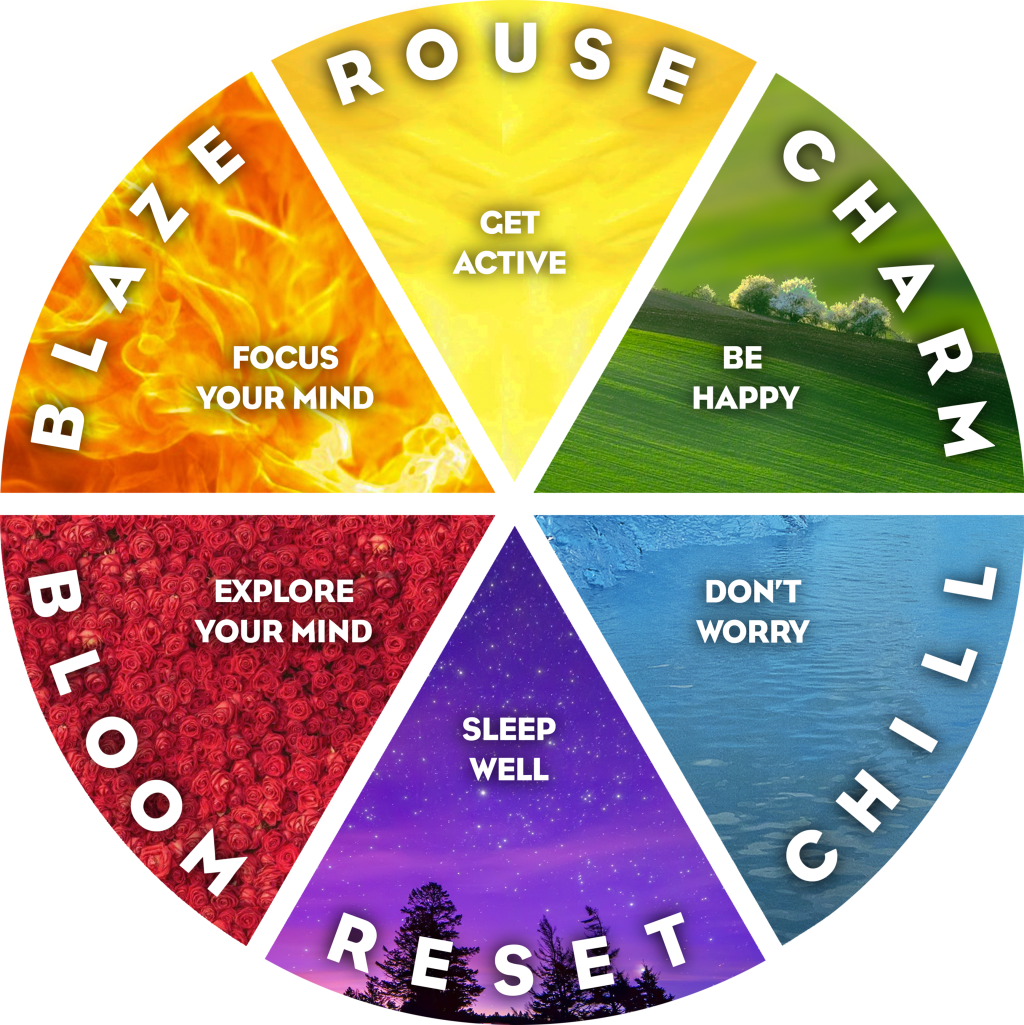
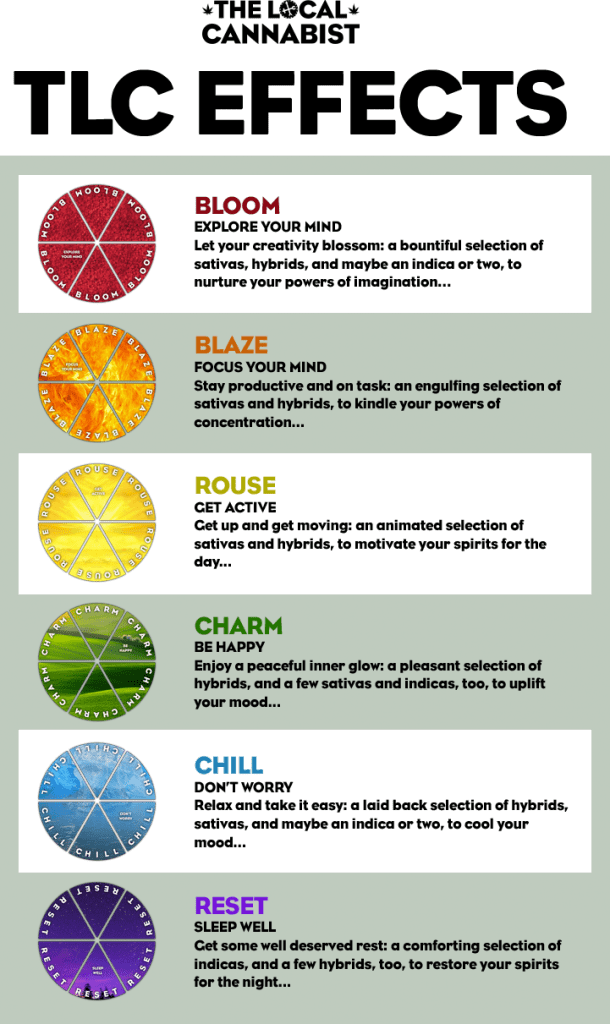
“TLC Effects” is a system conceived and designed to categorize all the various cannabis products into six categories that are both logical and intuitive.
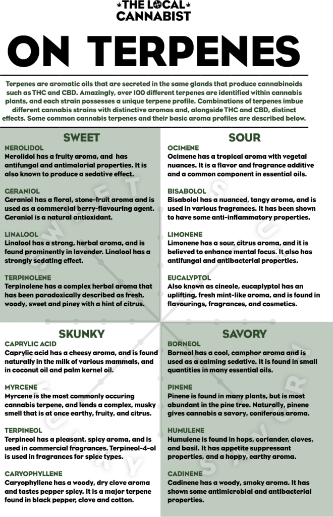
“On Terpenes” gives a comprehensive summary on the nature and characteristics of some of the most frequently encountered terpenes in cannabis, according to the THC Farmer Cannabis Cultivation Network.

“TLC Cannabis Aroma Wheel” represents the leading edge understanding of cannabis aroma, based to a great degree on “A Sensory 3D Map of the Odor Description Space Derived from a Comparison of Numeric Odor Profile Databases” an article by Manuel Zarzo published in Chemical Sciences.
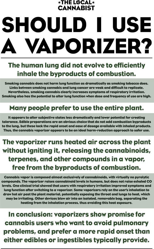
“Should I Use A Vaporizer” presents my paraphrasing of the summary of “No smoke, no fire: What the initial literature suggests regarding vapourized cannabis and respiratory risk“ an article by Mallory Loflin, MA and Mitch Earleywine, PhD, published in the Canadian Journal of Respiratory Therapy.

“Vaporization Temperatures” is a graphic representation of the boiling points of certain compounds within cannabis, rendered upon a thermometer graphic that borrows its form from the TLC logo.
Signage
My simple stairway signage design is shown in these mock-up photo-illustrations.

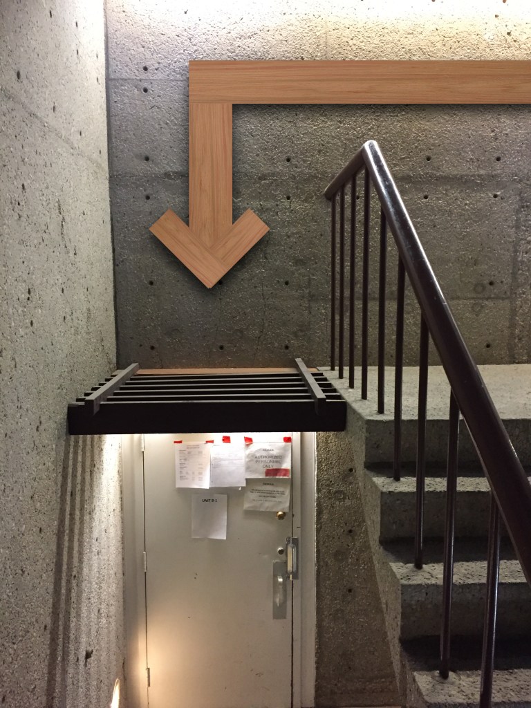
Installation views of the actual signage can be seen in the last section of this page.
Artwork
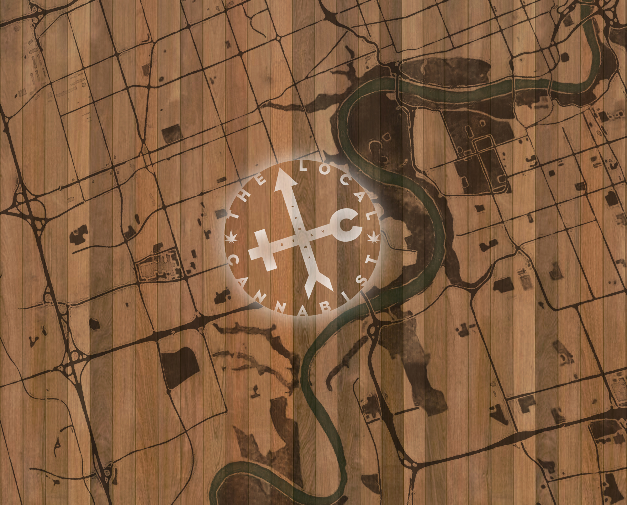
My mural design for the initial entrance wall of the store space combines the an aerial image of Edmonton, with the TLC logo centred on the store’s location, forming a map. The design was wood-burnt, painted, and installed by Black Artifex.
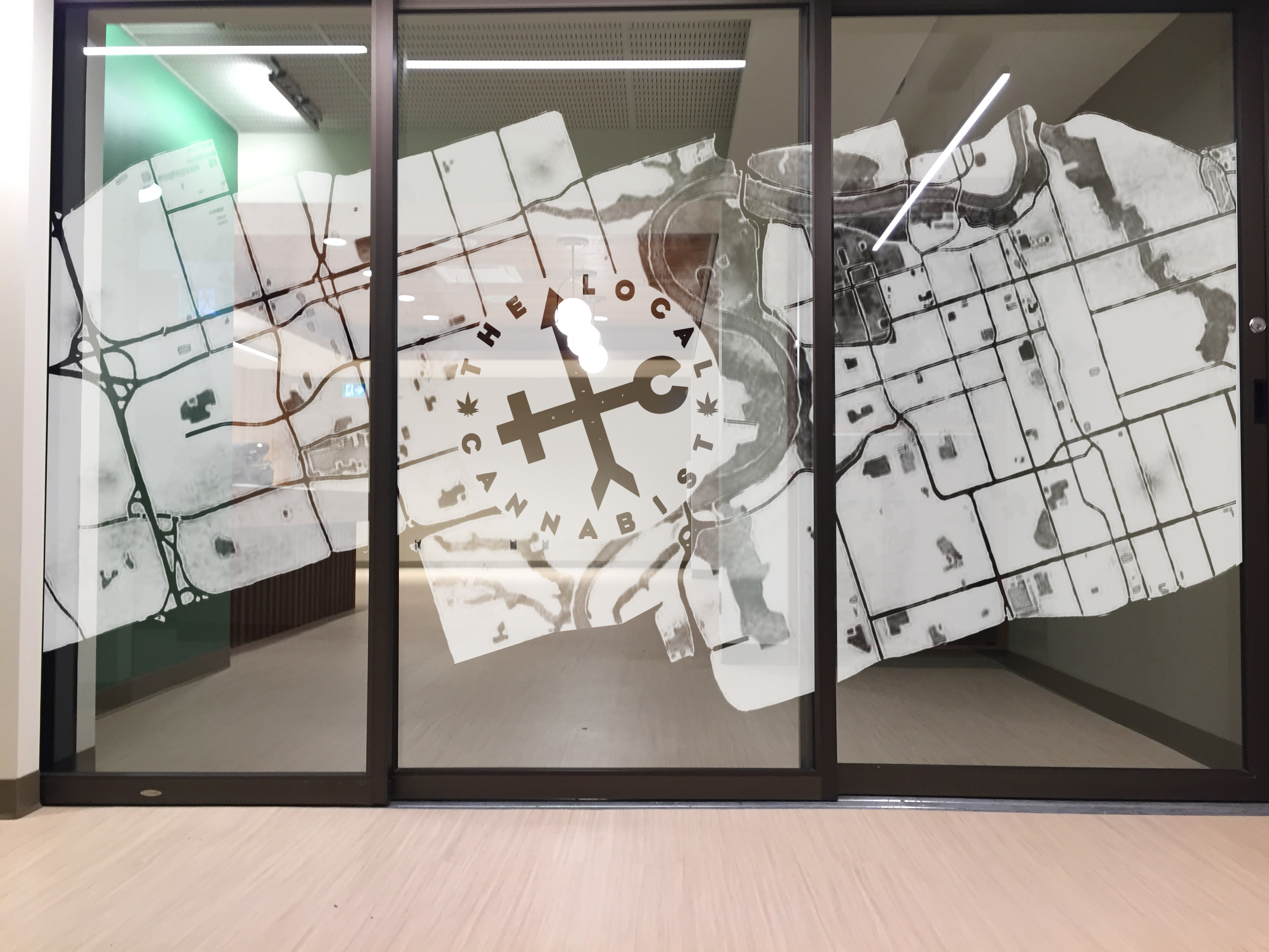
A variation on this design was also used as a frosted window graphic on both the interior and exterior of the store.
Installation Views
Sara Jewell Photography – Blue Graphite Interior Design.


