Inspired by this video, I’ve created proposed flag redesigns for a number of cities, provinces, states, nations, etc.
Municipal Flags
City flags are an abundant source of poorly designed visual compositions waiting for aesthetic improvement. Here are a few suggested municipal flag redesigns.
Boston
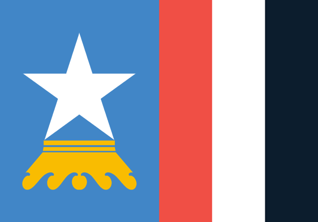
In Boston’s official historic and contemporary colours: at the hoist, a white star surmounted on a toppled gold crown, set in a field of Optimistic Continental Blue; at the fly, three stripes Boston’s Freedom Trail Red, Snow White, and Charles Blue. The star symbolizes the light of Reason rising above an overturned crown, symbolic of the tyranny of Authority, against the background of the Atlantic, reflected by the wave shapes within the crown, bringing to mind Boston’s evolutionary past and reputation as a center of education, science, and knowledge production.
Calgary
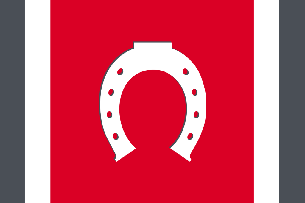
Intended as a natural evolution of the current official flag, this redesign features a white horseshoe emblem, symbolic of industry, humility, diversity, and good fortune, and representative of Calgary’s cowboy heritage. Turning the flag on its side, the emblem takes the form of the letter “C” to represent Calgary, and also signify the Character, Change, Culture and Charm that has become synonymous with the Calgary community. Red symbolizes Calgary’s history as a post for the North West Mounted Police, charcoal grey symbolizes the foundational oil and gas industry which has made Calgary prosper, and white symbolizes peace between all the diverse peoples of Calgary, represented by the nail-holes of the horseshoe.
Cardiff
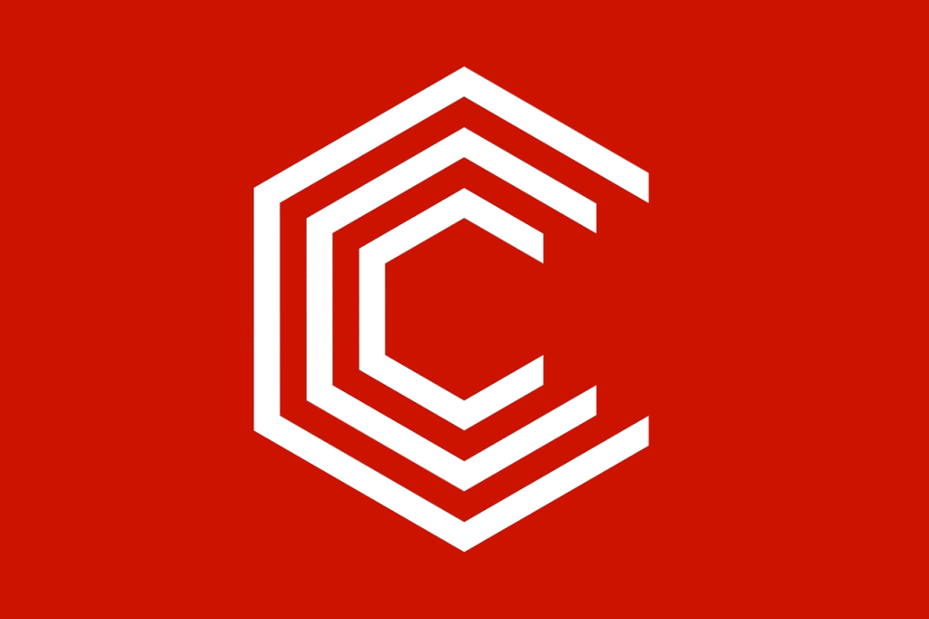
Based on the flag of the county of Glamorgan, of which Cardiff is the county seat, the flag combines the chevron elements to form a ‘C’ shape that is reminiscent of the ancient forts of the area.
Edmonton
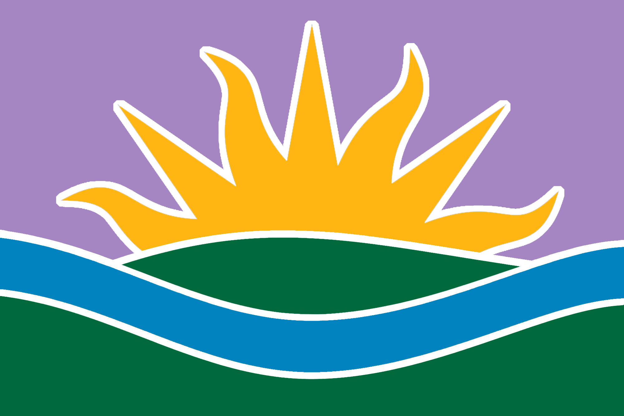
On August 23, 1876, Treaty No.6 was signed between the Plains, Wood Cree, Nakota, Saulteaux and Dene people and the Crown, and adhesion to Treaty No.6 was signed by Chiefs at a site in what is now known as Edmonton, on August 21, 1877. Incorporated as a town in 1892, and then as a city in 1904, Edmonton became the capital of Alberta when the province was formed a year later. Edmonton’s coat of arms was adopted in 1949, and the city flag was approved by council in 1966. On August 19, 2016, the Edmontonian Flag was presented to Edmonton Mayor Don Iveson by Confederacy of Treaty Six First Nations Grand Chief Randy Ermineskin, as a symbol of reconciliation and their commitment to collaboration, respectful dialogue and exploring shared opportunities, to symbolize a new dawn in Nation-to-Nation relationship building. This design borrows from traditional official municipal and provincial imagery and symbolism, and makes relevant and reverent reference to the evocative words of Treaty no. 6, paying homage to the adhesion to Treaty No.6 by Chiefs at a site in what is now known as Edmonton, on August 21, 1877, making the flag an official and enduring symbol of respect for this important, historic founding document. The flag shares the colours of Edmonton’s official City Tartan. Purple represents courage and authority, creativity and freedom. Gold represents prosperity and enlightenment, happiness and energy. Blue represents stability and loyalty, strength and trust. Green represents harmony and freshness, growth and vitality. White represents peace and openness, and the frost of winter. Inspired also by Edmonton’s reputation as a Festival City, as a Gateway to the North, and as the City of Champions, the design combines the hills of Alberta’s coat of arms with the sun and river symbols and colours from Edmonton’s coat of arms, to make a new flag for Edmonton that can stand as a proud civic symbol “as long as the sun shines, grass grows, and rivers flow”.
Iqaluit

A redesigned and simplified civic flag, based on Iqaluit’s current official flag.
Milwaukee
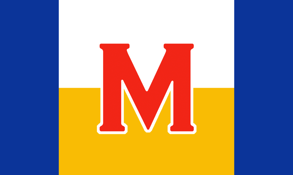
Based on Milwaukee’s current flag, this design incorporates blue on each side, representing the rivers and lake waters of the port city. The centre features a white and yellow area, symbolizing the balance of industry and agriculture, and representing peace (white) and prosperity (gold). The red of the central ‘M’ (taken from the typographic element of the current flag) represents the passionate spirit and courage of the people of Milwaukee’s past, present, and future. And, since Milwaukee is famous the world over for its brewing industry, the flag’s resemblance to a depiction of a glass of frothy ale is not accidental.
New York City
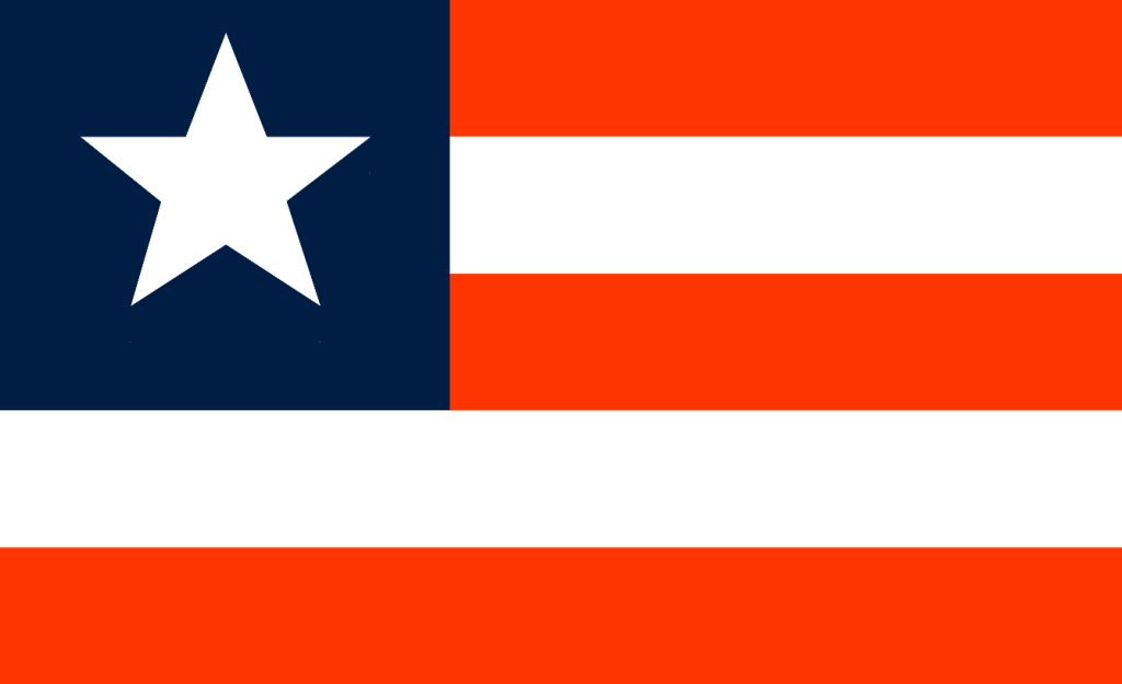
A design based on a simplified US flag, with one star representing “America’s city” and, using New York City’s traditional Dutch colours, five orange and white stripes, to symbolize NYC’s five boroughs.
Red Deer
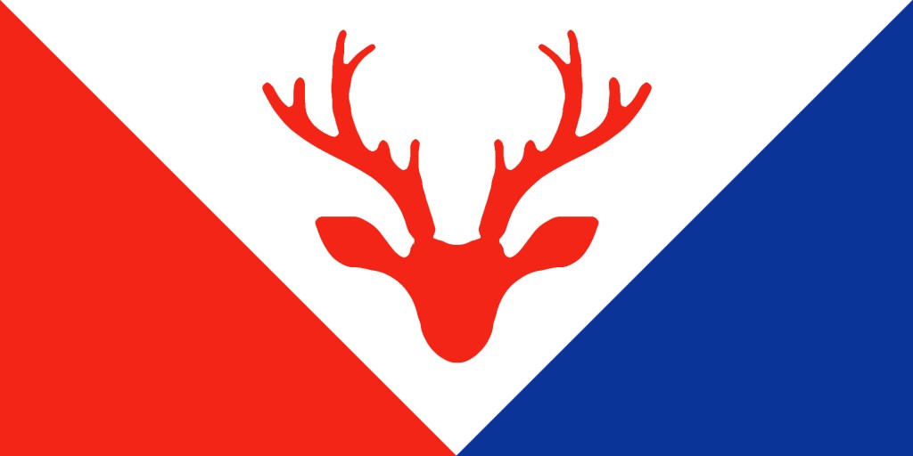
A simplified, updated design for Red Deer, featuring an antlered head of its eponymous animal.
St. Albert
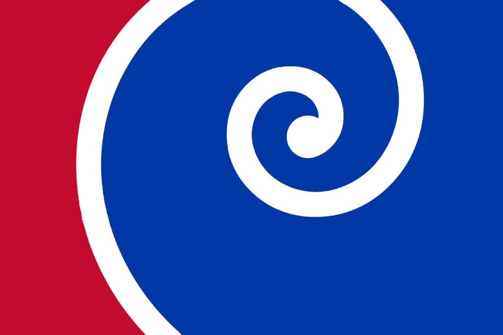
A design based on the colours of the current flag, and the spiral crosier of Albert of Louvain, for whom the city of St. Albert is named. The logarithmic spiral also symbolizes scientific achievement and the beauty of the natural world.
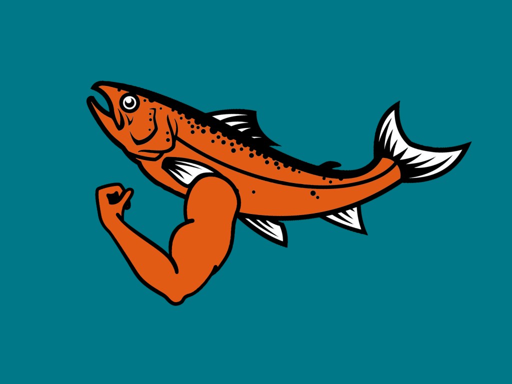
Salmon Arm
San Francisco

An updated design based on the current official civic flag.
Saskatoon
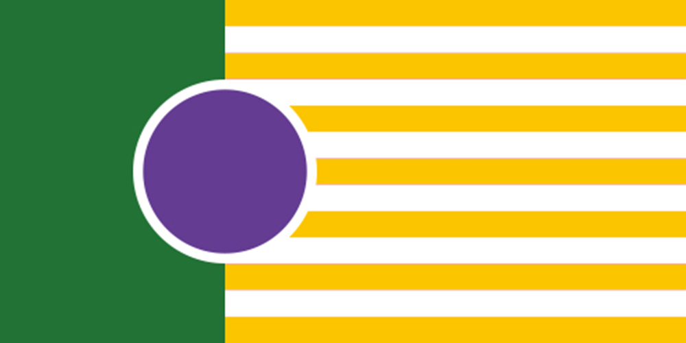
Saskatoon is the largest city in Saskatchewan, Canada. The current flag features a coat of arms and a sprig of Saskatoon berries on a green w/ yellow and white stripe flag. The city of Saskatoon is named for the berry. My redesign replaces the coat of arms and the berry sprig with a single purple circle, symbolizing the Saskatoon berry.
Seattle
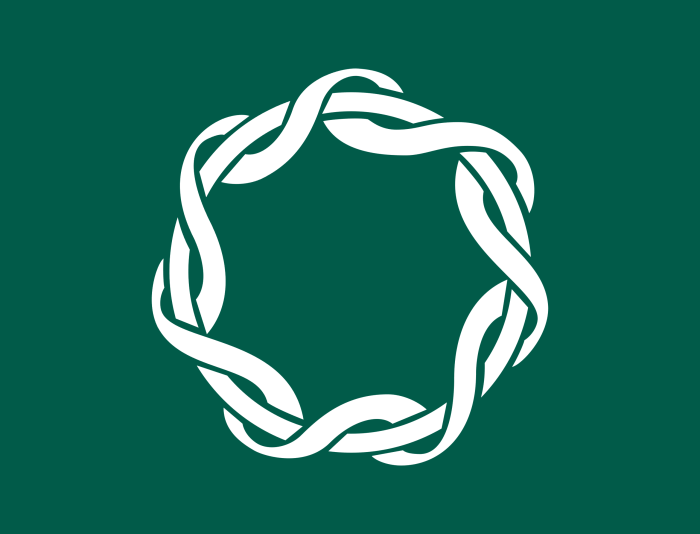
Based on the current Seattle flag, and Seattle’s moniker as “The Emerald City”, I’ve chosen a natural, teal blue/green that leans toward emerald for the background colour, and peaceful white for the foreground (a nod to another official moniker, The City of Goodwill).
The central motif, taken from the official current flag, brings to mind waves, and braided rope, symbolic of seafaring industries, or intertwined cables, in reference to the city’s strength as a center for digital and tech industries, or perhaps a ring of braided sweetgrass. In this way, the knotted circle brings to mind themes from Native American, Scandinavian, Asian, and African art, and further symbolizes the importance of family, and the interwoven and harmonious life of all the citizens of the city. The passing resemblance to a tambourine is a nod to the city’s fame as a musical wellspring. Some may even think it looks like the Seattle Great Wheel.
Finally, a subtle letter “S” is repeatedly featured, standing for Seattle, of course.
Whitehorse
A banner of arms, based on the historic Whitehorse coat of arms.
Yellowknife
Inspired by Yellowknife’s current flag, this simple design features the yellow knife from the official city coat of arms (its colour symbolizing the mineral riches of the area) on a field of blue (symbolic of Great Slave Lake), also taken from the coat of arms.
State and Provincial Flags
So many current official Canadian provincial and US state flag designs are notoriously ill-considered. Here, I’ve attempted to pick some low-hanging fruit…
Alberta
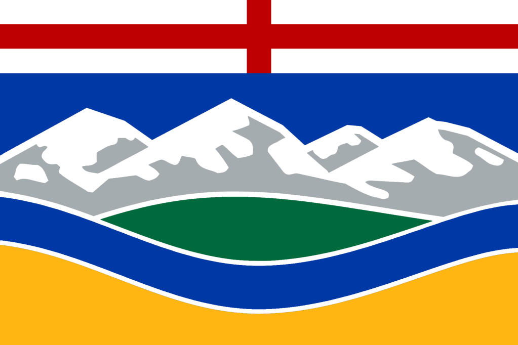
A simplified design, based on Alberta’s coat of arms, as seen in the centre of the current flag.
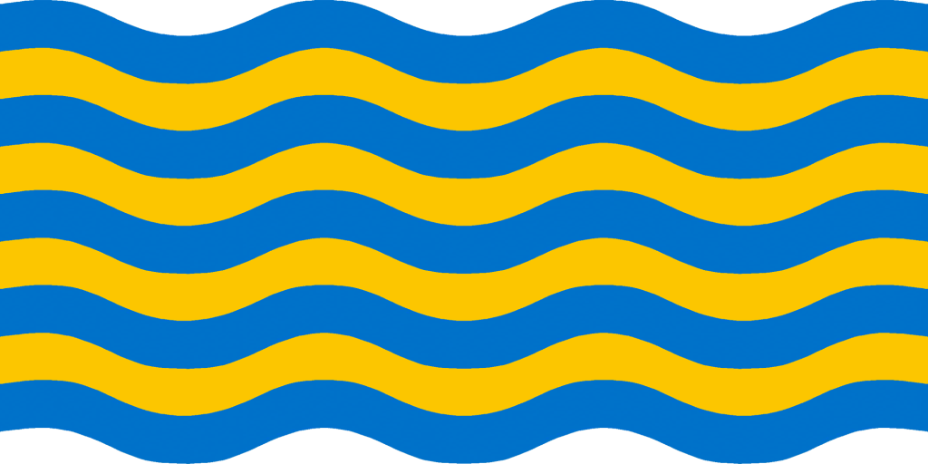
Hawaii

Based on the current flag, the British colonial canton has been removed, and the eight red, white, and blue stripes, symbolizing eight islands, have been turned into waves to emphasize the state’s oceanic geographic setting.
The shape of the flag itself would ideally follow the waving lines at top and bottom, as seen above.
Manitoba
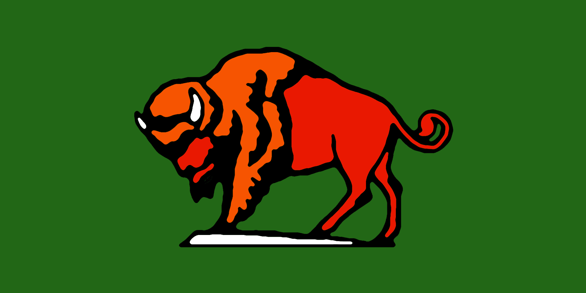
A redesign of Manitoba’s provincial flag, reducing the imagery to a red and orange bison on a white rock in a green field, taken from the escutcheon of Manitoba’s coat of arms.
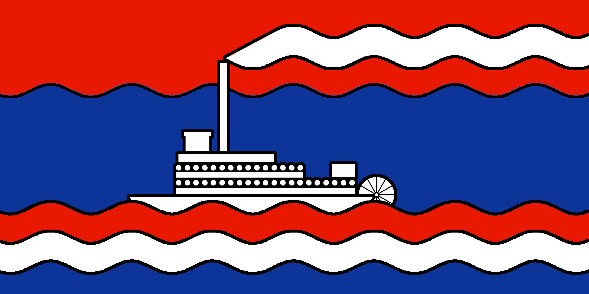
New Brunswick
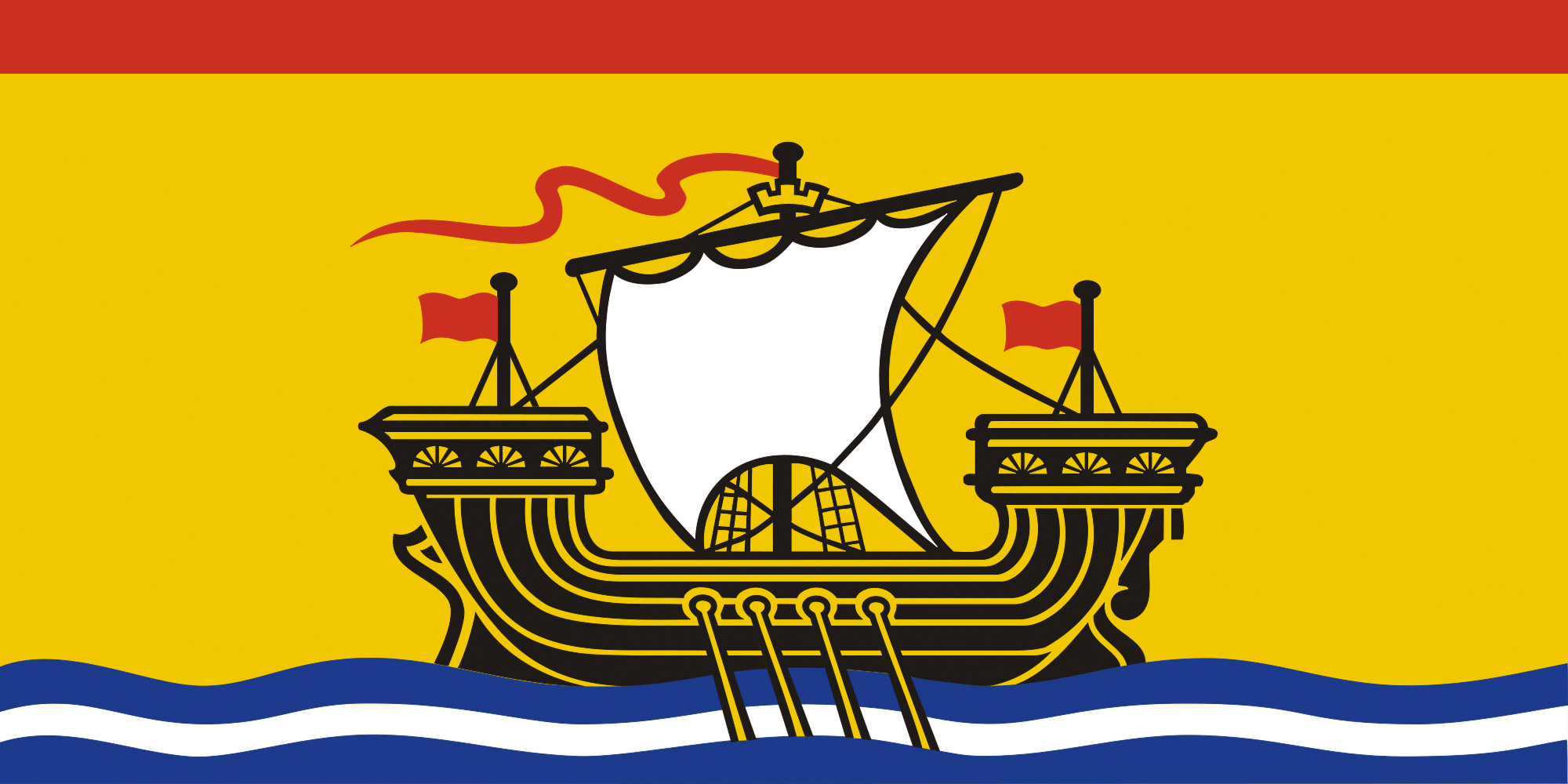
Based on New Brunswick’s lovely, but exceedingly intricate current flag, the lion has been eliminated to allow the ship more room to sail on a redesigned 1:2 proportional ratio, to match these other Canadian provincial and territorial flags.
Newfoundland and Labrador
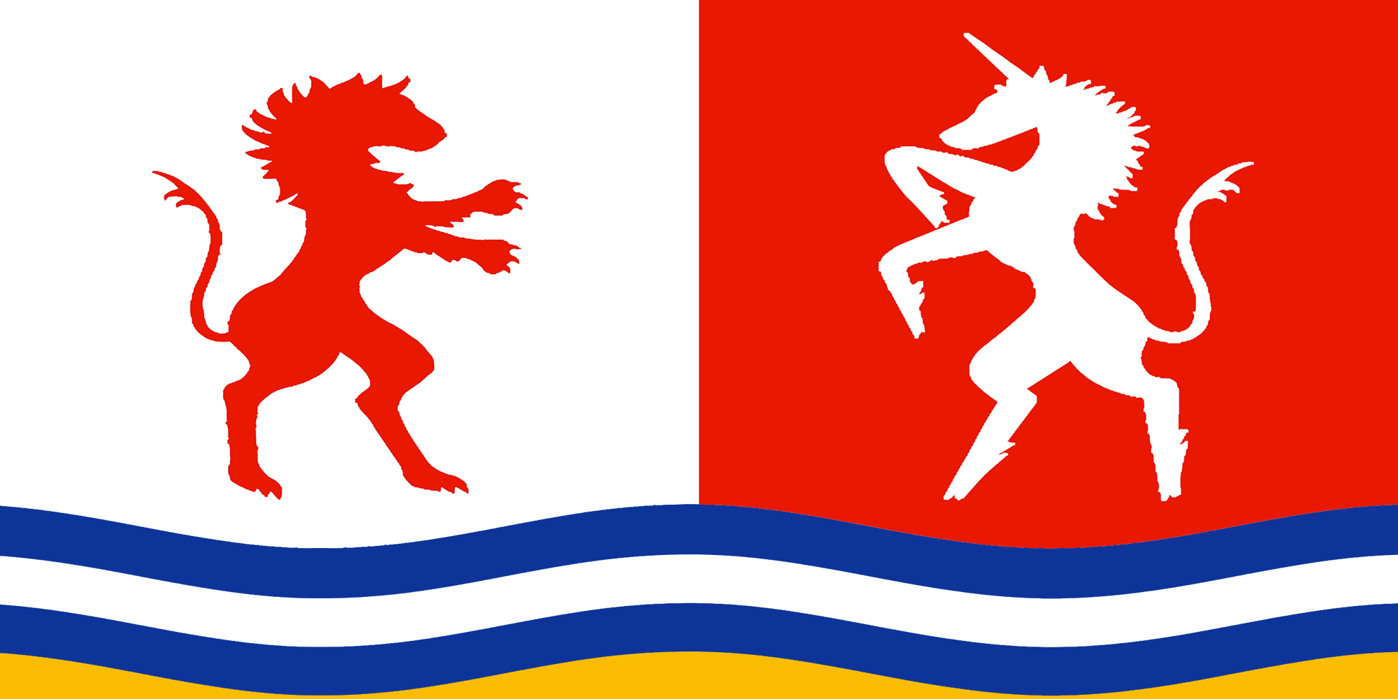
A design more in keeping with the heraldic feel of the other maritime provincial flags. The Lion and Unicorn come from the Newfoundland and Labrador coat of arms, and symbolize courage and hope. The wavy white and blue lines symbolize the bounty of the sea, while the gold symbolizes the wealth of natural resources.
North Carolina

Inspired by the geography of the state, the flag’s top blue area represents the Blue Ridge Mountains, and the bottom blue area represents the Atlantic coastline of the state, and the single star symbolizes North Carolina’s sovereign Statehood within the United States of America.
Nova Scotia
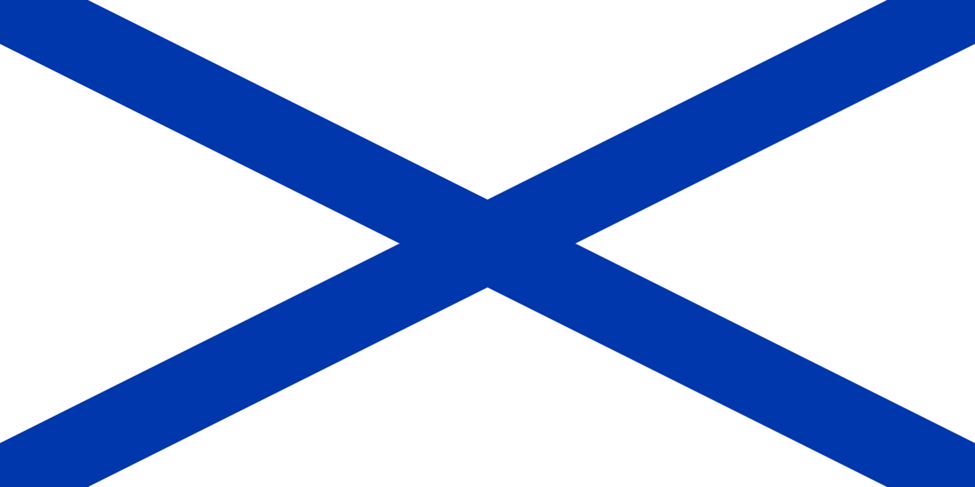
Based on Nova Scotia’s current flag, the blue saltire on white is a reversal of the Scottish flag, but the redundant Scottish symbolism of the red lion rampant on the yellow shield (which was only added to the design in the 19th century in order to distinguish it from the Imperial Russian Naval Jack of the time), has been removed to avoid redundancy.
Nunavut
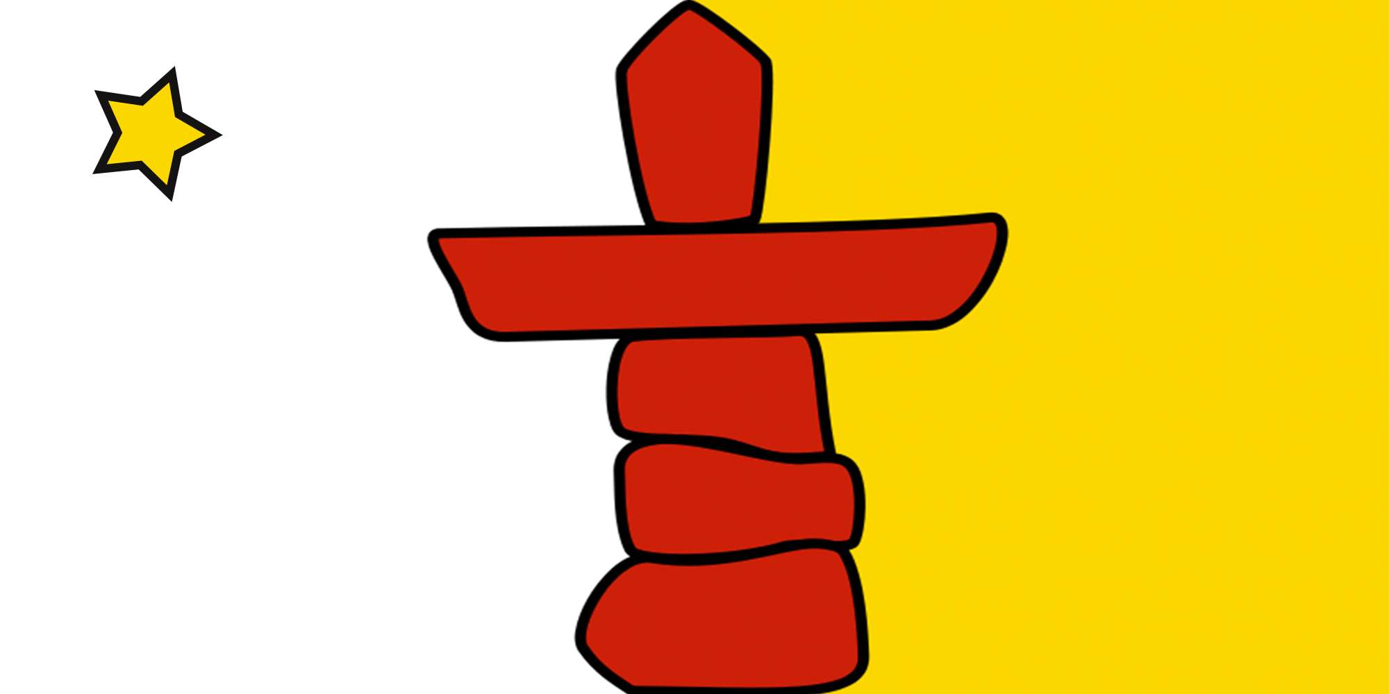
Based on Nunavut’s current flag, but reversed to put the North Star in the canton, and changed the star’s colour from blue to yellow, with an added black outline, thus reducing the number of colours, matching the style of the inuksuk, and representing Polaris as the ‘yellow supergiant’ star that it is in reality.
Northwest Territories
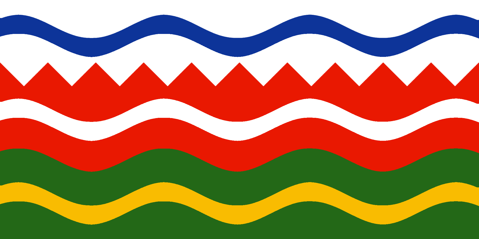
Based on the Northwest Territories coat of arms, the white section of the flag, with a wavy blue line dividing it, represents the Arctic Ocean and the Northwest Passage. A horizontal zig-zag line, representing the tree line, divides the upper from the lower portion: a green and red section with green symbolizing the trees and red symbolizing the tundra. The gold wavy line in the green section and the white wavy line in the red section represent the abundant minerals and furs upon which the history and prosperity of the Northwest Territories has been based.
Ontario

Based on central feature of Ontario’s coat of arms, as seen on the current flag, three golden maple leaves are joined on a green field.
Prince Edward Island
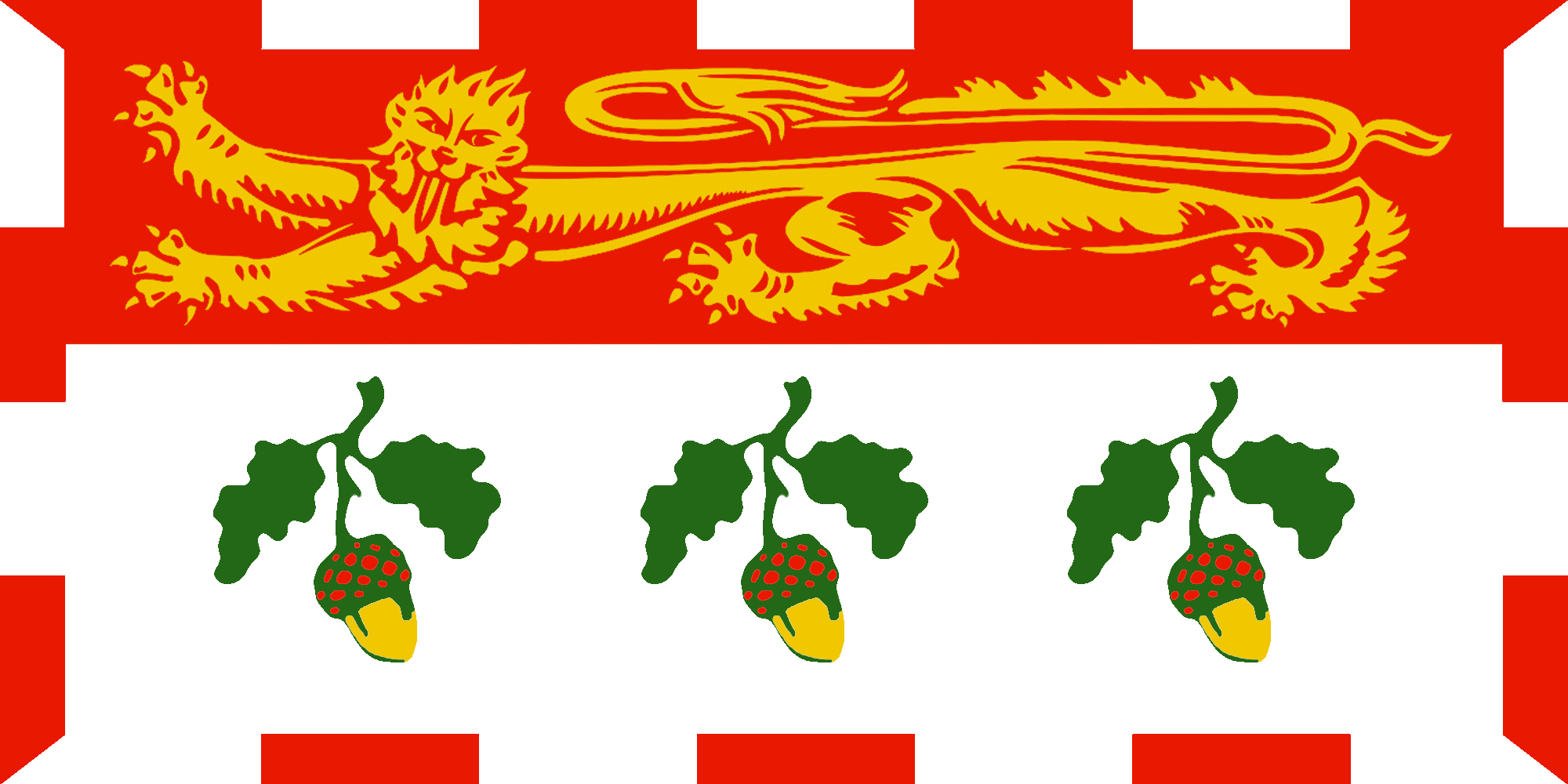
An updated design for PEI’s flag, replacing the oak trees from the original with three acorns, and replacing the lion with the one from New Brunswick’s flag, and continuing the previously incomplete decorative border around the hoist edge.
Québec
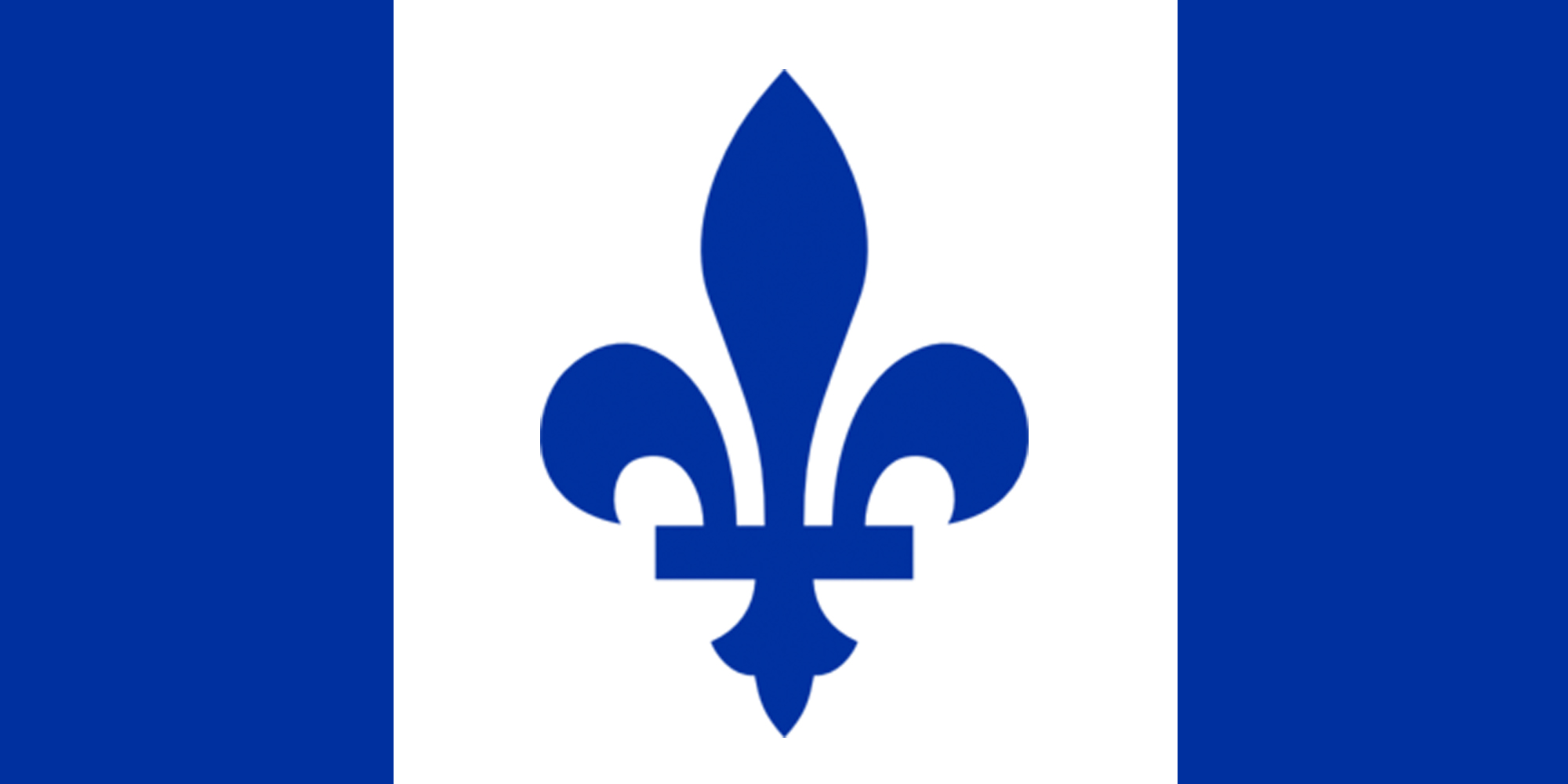
Based on Quebec’s current flag, this design eliminates the unnecessary repetition of the fleurs de lis, and intentionally resembles the Canadian flag, expressing either Quebec’s inseparability from Canada, or its independent equality with Canada, depending on your own perspective.
Saskatchewan
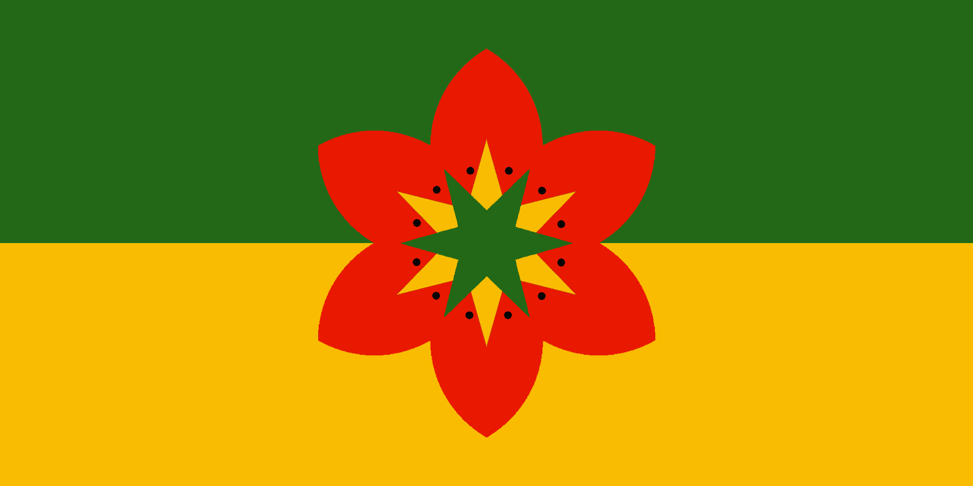
Based on Saskatchewan’s current flag, the green symbolizes the northern forests, the yellow symbolizes the southern farms. Saskatchewan’s official flower, the western red lily, also seen on the current flag, is depicted in a more simplified form in the centre. This image could also be seen as the heads of six baby grouse chicks (the sharp-tailed grouse is Saskatchewan’s official bird), symbolizing cooperation and healthy competition, family, and new beginnings.
Yukon
Based on the Yukon coat of arms, the red part of the flag represents Yukon’s mountains, with the gold circles representing the territory’s mineral resources and its birth in the Klondike Gold Rush. The two white wavy lines represents the territory’s rivers.
National
Many of these designs are new flags proposed for former British colonies which still feature the British flag on the canton of their own national flags. These designs eliminate those colonial trappings in favour of more sovereign and unified symbolism, to better represent these nations in modern times.
Australia
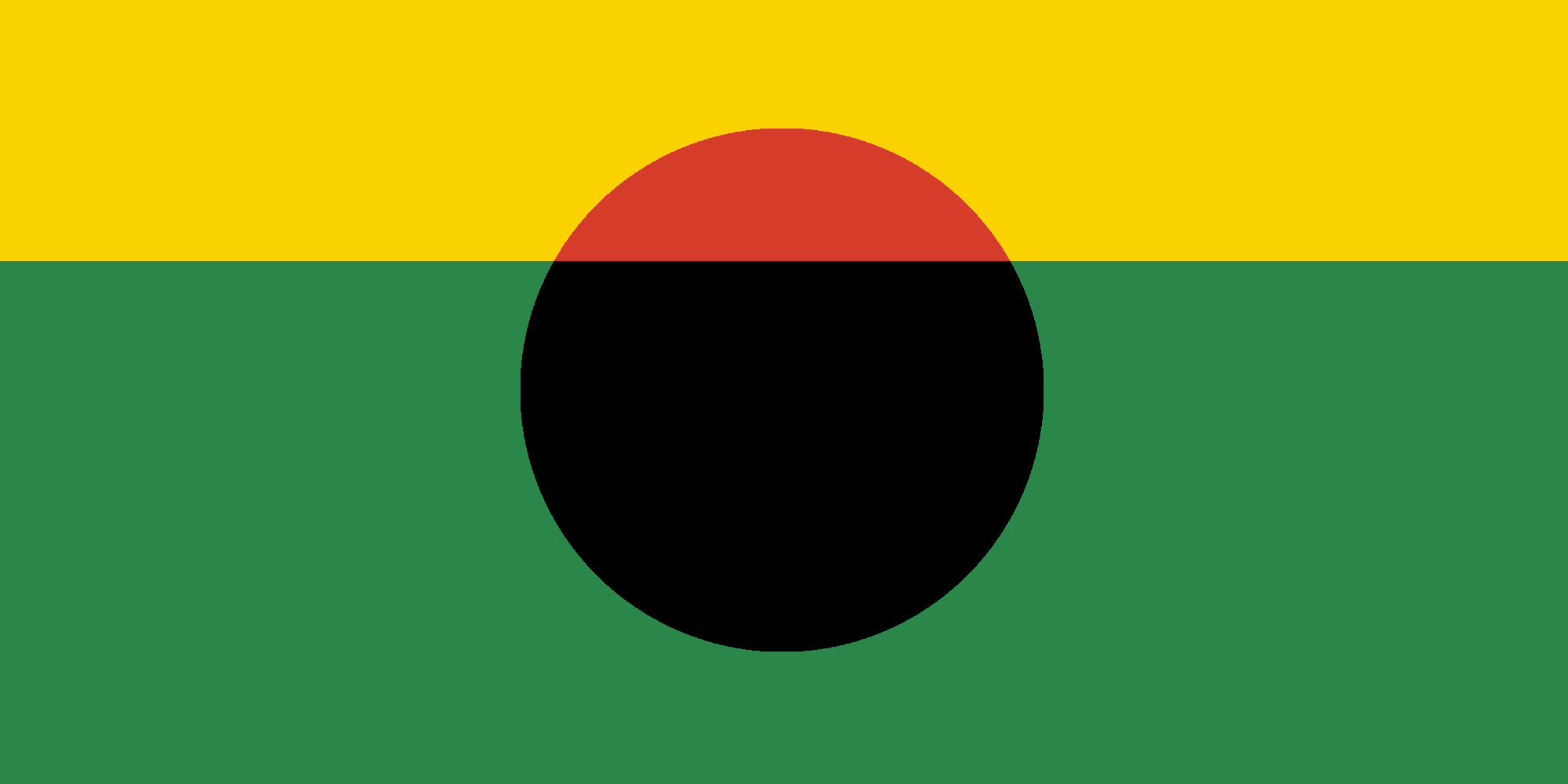
Inspired by the Australian Aboriginal flag, and incorporating the national colours of Australia, encompassing the well-documented symbolism of both, my simple flag depicts red Uluru against a yellow sky, casting a black shadow across a green ground, as a natural, unique national emblem.
Cook Islands
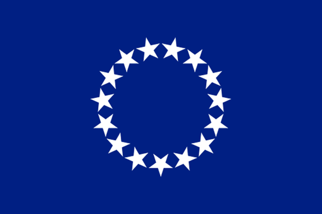
Based on the national coat of arms, depicting fifteen stars representing the major islands of the nation. A very straightforward ‘banner-of-arms’ style redesign.
Cyprus
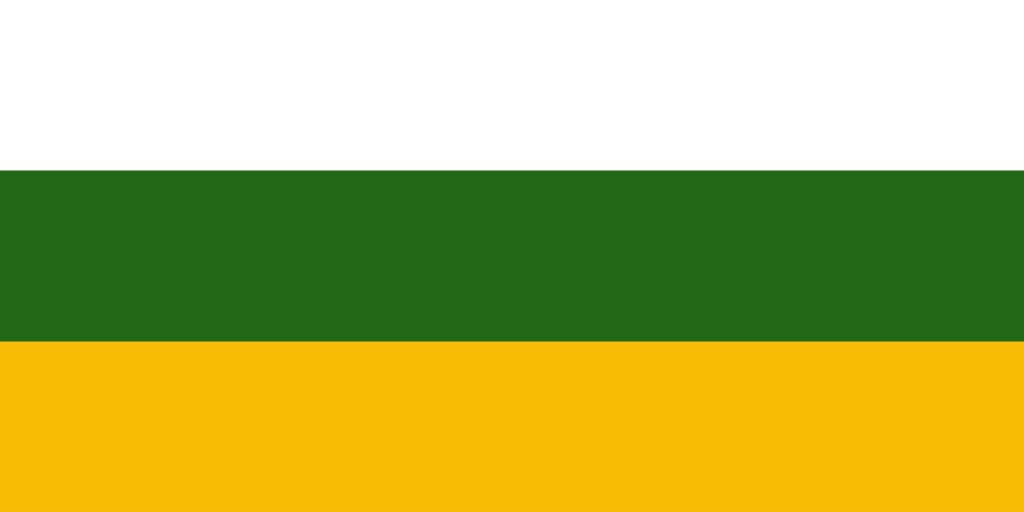
Simple tricolour flag in the traditional colours. Gold represents mineral wealth, green represents natural beauty, white represents peace among the people of Cyprus.
Fiji

The light and dark blue symbolize the skies and seas of Fiji, and pay tribute to the “banner blue” of Fiji’s anthem. The gold represents the warm Fijian sun, and the wealth of the nation. The sun represents sovereignty and national unity. The whole image can be seen simply as a golden sun rising in the sky over peaceful waters, or a sandy island in the ocean, or a gold medal on a blue ribbon, symbolizing high achievement.
New Zealand
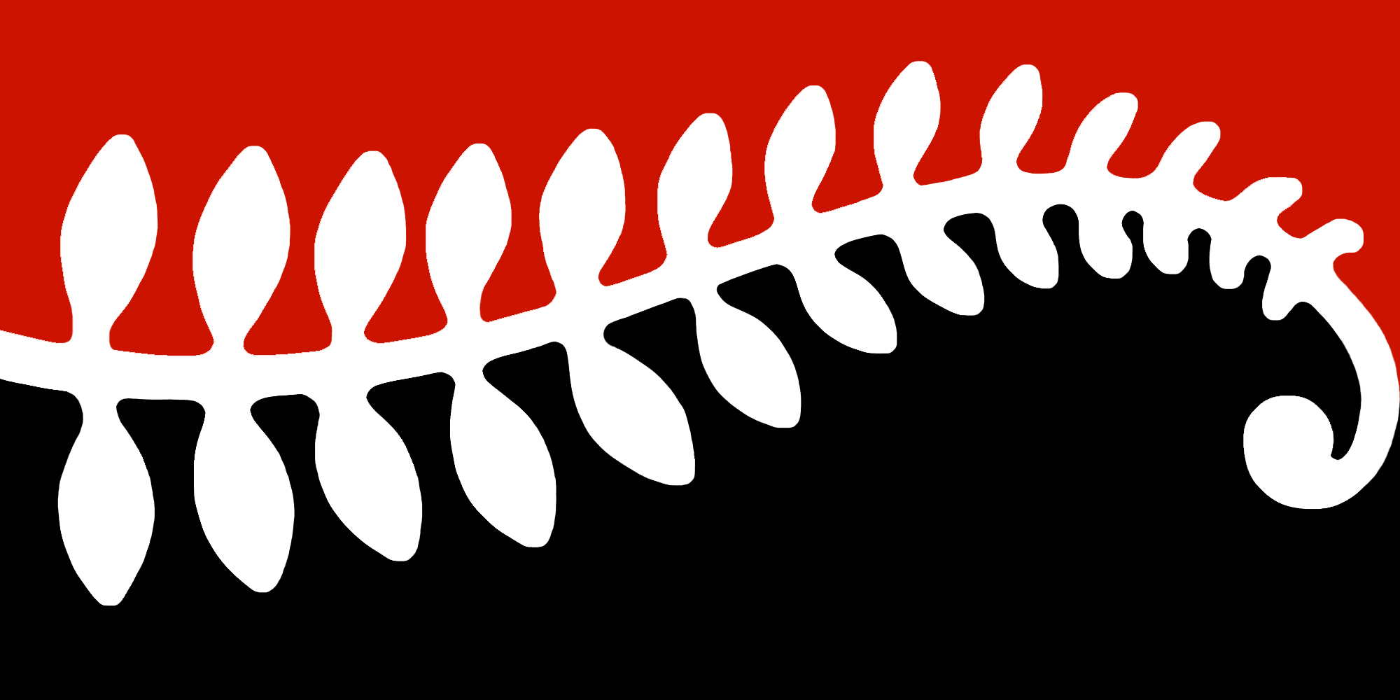
In New Zealand’s three official colours, a silver fern frond unfurls its koru across a dark sea and red sky (“… at night, sailors’/shepherds’ delight…”). The flag’s traditional 2:1 proportional ratio pays tribute to New Zealand’s heritage as part of British colonial history, while the design layout shares similarities with the tino rangatiratanga. The flag immediately communicates the Kiwi pride in, and respect for, the beauty and importance of their natural environment, being an image of nature itself. The land of the long white cloud. Past, present, future. The sea and the sky. The Silver fern and the Koru. The national colours: kokowai, black, and white.
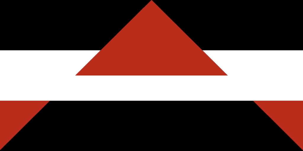
Using the three official national colours of NZ, and the traditional 1:2 scale, the flag’s imagery suggests a capital ‘A’ for Aotearoa [“Land of the long white cloud”], and depicts a mountain peak in a “long white cloud”, or an island poking from the surface of the water.
Tuvalu
Tuvalu is one of the few former British colonies, now sovereign countries, still flying a national flag featuring the Union Jack in the canton (Australia, New Zealand, and Fiji are the others).
This rippled-edge flag is simply based on Tuvalu’s coat of arms. The nine alternating waves represent the nine islands of the nation. Adopting such a new national flag would help Tuvalu raise international awareness about the precariousness of their islands’ existence.
Continental
As the only politically undivided continent on Earth, a single flag to represent Antarctica makes some sense. Below is my design.
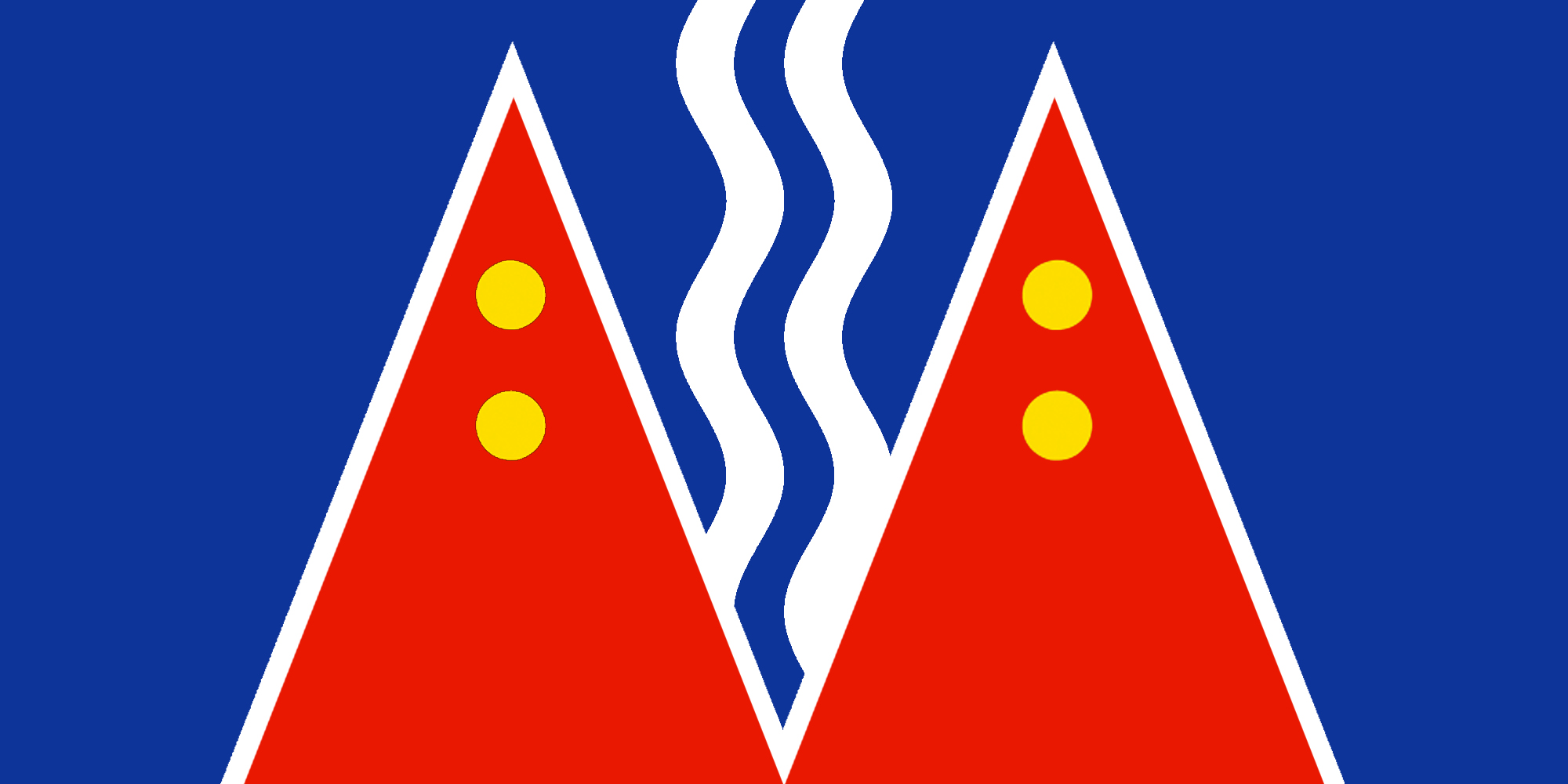
Antarctica
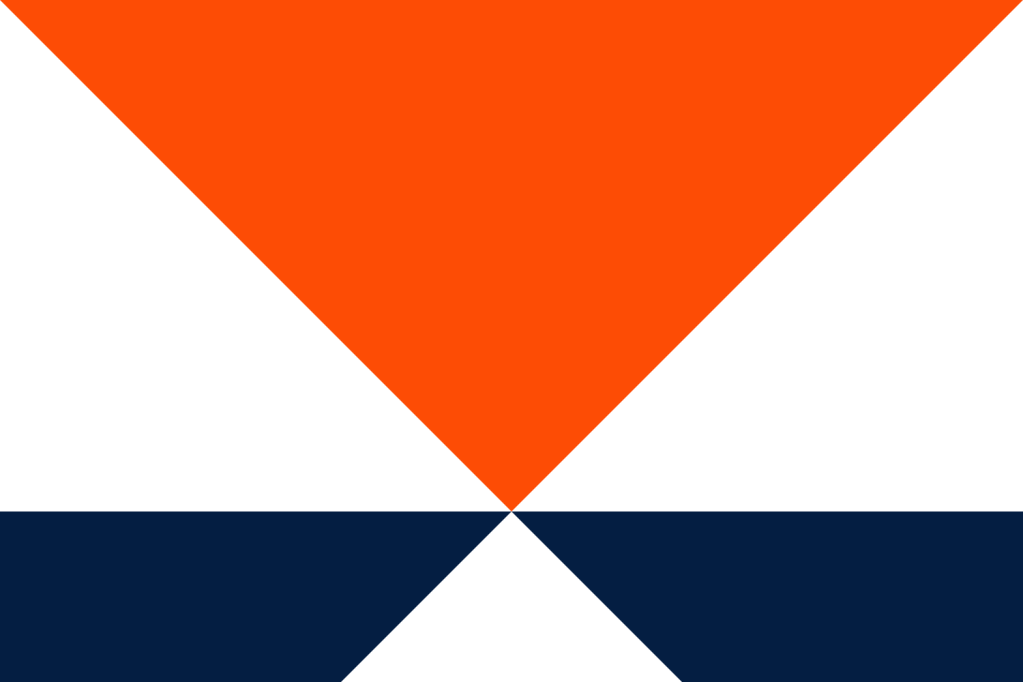
This high-visibility design incorporates a large, downward pointing triangle, symbolizing South, as a brilliant orange sky, seen through the gap between two snowy mountains. Deep shadows, or dark waters, flank a snowy path leading forward.
Global
While the utility of a global flag is debatable, designing one is certainly an interesting challenge. Here’s mine.
Earth
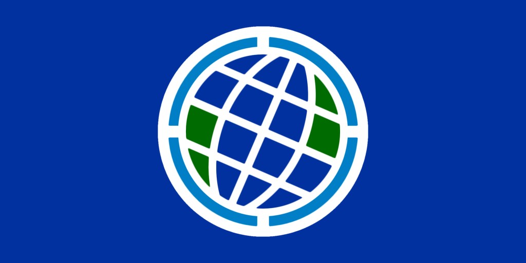
White represents peace, blue represents hope, green represents life. The central image represents the globe with lines of latitude and longitude and an axial tilt of 23.4 degrees, matching that of Earth. The proportion of green within the circle approximates the proportion of land surface on Earth. The light blue symbolizes the planet’s breathable atmosphere.
